
Identify where to act to unlock your workflow
Struggling with complex workflows? Learn a straightforward method to pinpoint key areas for improvement and unlock smoother, more efficient processes.
I dislike wired headphones. They always get tangled up and you must spend an awful lot of time trying to untangle them while your phone is ringing.
The problem with the workflow model created in the previous step is that it often looks like a tangled-up headphone wire! It does not make your workflow look less complex. All you have now is a bunch of variables connected with plenty of arrows.
What can you do now?
This post explains an easy method that we use to make sense. We discovered this method in training a few years ago by Bernhard Sterchi.
Four steps to find where to act
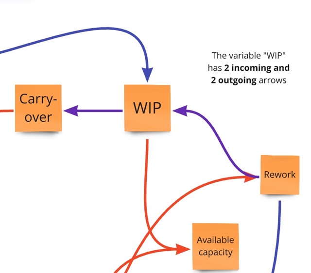
- For each variable, count the number of outgoing and the number of incoming arrows. Now each variable has 2 coordinates. The first number (“outgoing”) is the X-coordinate, and the second number (“incoming”) is the Y-coordinate.
-
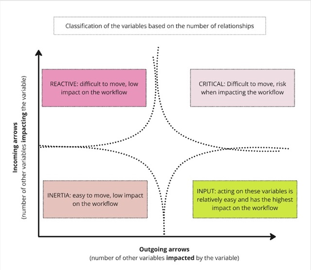
Draw a chart where you can position each variable, based on its 2 coordinates.
-
The X-axis is the number of outgoing arrows. It represents how much changing this variable will impact the workflow. More outgoing arrows mean more influence on the workflow.
-
The Y-axis represents how much what happens in the workflow influences the variable itself. More incoming arrows mean more dependency of the variable on what happens in the workflow.
-
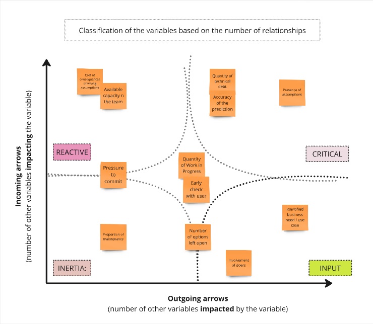
- Now you can classify the variables depending on their position on the chart, as shown in the above and below pictures:
-
Variables that are influenced by the workflow but have little influence over it are placed in the top-left quadrant. These are called “reactive” variables. They are not easy to evolve, and changing them has a relatively low impact on the workflow. You don’t want to use your energy on these variables.
-
By contrast, the bottom-right quadrant (high impact on the workflow, low impact from the workflow) is the land of “input” variables. They are much easier to move and have a much bigger impact on the workflow. You want to act on these variables first to influence your workflow.
-
Variables located in the top-right corner are difficult to move (high influence from the workflow), and there are risks when moving them (high influence on the workflow). Handle these “critical” variables with care. They are not your priority.
-
Variables located at the bottom left are the ones that you don’t really care about. Although you can easily move them, they have a low impact.
- Within the bottom-right “input” variables, choose the ones you can directly influence. This is your starting point for improving your workflow.
Conclusion
The chart and the classification of variables into the 4 different quadrants is a way to make sense of and untangle the workflow model that was the starting point. The “input” variables at the bottom-right of the chart are leverage points. Moving them is relatively easy and has a relatively high impact. In other words, the ratio of impact on the workflow to effort is the highest for these variables.
Remember: your goal was to break the vicious circles of your workflow. The way to do this is by acting on “input” variables first. How to define actions is what we will cover in the next post. Stay tuned, you are on the right track
This blog post is part of the 1h Event Storming book that we are currently writing.


Leave a comment